Bruce Mulcahy – Gouache demonstration

Bruce Mulcahy came to Glasshouses from Teeside to demonstrate gouache painting for Pateley Bridge Art Club members and interested local people.

Although he paints in oils, acrylics and gouache, he prefers gouache for outdoor paintings as he can reduce the weight of materials he carries, he can work quicker and the painting dries for safe transport. If weather or light changes cause interuption to an outdoor session, the painting can easily be rewetted and recommenced.
He used 240 gsm watercolour paper and thin stiff flat brushes.

For the demonstration he used an enlarged photograph of a garden.

Bruce gets his painting tray ready with his selection of gouache paint colours. He adds white gouache to each colour mix to make sure they are not tranparent and can cover the painting surface well.

He sketches the outline of the main features in pencil.

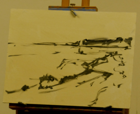
Bruce started painting the darkest features first with a mix of Vandyke brown and blue. These colours create a very dark mix. He uses thin flat brushes, painting quickly. He does not look for precision as he can use refine lines with other lighter opaque colours later.

He continues with smaller dark features.

Bruce working from the photograph, his work is also projected onto a screen for the members.

Greys, greens and blues painted with the thin stiff brush.

Details refined with lighter colours.

Bruce Mulcahy’s painting at the end of the demonstration.

Other incomplete paintings that he showed us to illustrate his range of subjects and styles.

Heather Burton demonstration

Heather Burton travelled from East Yorkshire to demonstrate painting in acrylic paint applied with a palette knife. The demonstration attracted a full room of members and guests. The painting work was projected onto the back wall to enable everyone to see the detail.

Heather explained how palette knives are designed to enable artists to hold the handle in a firm grip whilst the blade can be flat over the painting surface. This enables an even application of paint from along the blade if desired, loading with paint and tilted in order to spread sideways evenly.

There are many shapes and styles of palette knife. Various lengths, widths and edges.

Building up colours and layers

Heather showed how the palete knife could be used on paper and also on textured surfaces. She illustrated sweeping curves, circular sweeps, flicked grasses, stylized tree, house and windows.

Examples of paintings by palette knife by Heather Burton

Tracey Krupianka Acrylic Painting

Following a successful Zoom demonstration of flower painting in April, Tracey was invited to demonstrate landscape painting. Tracey choose to paint a snowy woodland scene in acrylic paint on board.

A splendid turnout on a cold winter night

Tracey had painted similar scenes before. She used a variety of acrylic brands with mainly flat brushes, swordliner brushes and a Rosemary’s “deerfoot” stippling brush in soft badger hair.

Background washes

Background trees using flat brushes

Undergrowth painted with Deerfoot stiple brush

Painting in progress at the break

Aplication of white acrylic with a pallet knife

Rabbit

Human Figures Added

Painting at end of demonstration

Cath Inglis Pastels

Cath Inglis is a pastel artist and tutor from York who is also a professional associate with the SAA, a member of the Society of Women Artists, winning awards at their London exhibitions, and an Associate Member for Unison Colour Pastels and an online tutor for the Pastel Academy. She paints a wide variety of subjects including landscapes animals and portraits.

After having six Zoom demonstrations we had our first live demonstration. We had 18 members and guests and observed COVID precautions.

The image projection system helped to enable members to see Cath’s detailed painting and the sound system amplified Cath’s commentary. Thanks go to Gordon for organising it and passing on to three members on how to set it up.

The subject for the demonstration was a golden retreiver. Cath has used the image for many demonstrations to art clubs but each one is unique, uses many colours and shades.

Images of golden retreiver outlined on grey Hermes sandpaper.

Cath uses soft pastels made by Unison and Sennielier and thin, harder pastels by Conte for painting the detail. Pastel paints can be removed with a stiff brush and new colours applied.

Cath applied base colours with the side of the pastel (the paper covering needs to be removed). The light hair colour was Unison portrait brown (2464 – a light yellow). A purple on nose and black under the nose and lower jaw.

Cath demonstrated painting an eye in pastel on Canson Mi Teintes paper, colour Moonstone. This specialist paper has a good tooth suitable for pastel painting.
She used shades of blue, browns, oranges, purples and whites to catch reflected light.

A close up of the eye on the grey Hermes sandpaper.

Detailed colouring around the mouth using many colours and shades of red, blue, purple. Highlights on nose, cool blues under lips

After background coloured in purple, stray hairs applied.
Dark specks applied to muzzle and light hairs under nose.

The portrait at the end of demonstration.

Paul Talbot-Greaves

Paul is an experienced artist from Brighouse who previously ran a demonstration and a workshop for the club in 2016.
In September 2021 he ran a demonstration on Zoom for 14 members. The subject was a canal scene based on the following photograph. Images during painting were taken from a computer screen.

Photograph of canal

Paul choose Sanders Waterford 300lb (640 gsm) paper half imperial size (22 by 15 inches).
He used fresh tube paints. alizariun crimson, Winsor violet, sap green, cobalt blue, ceruleun blue, french ultramarine, burnt sienna and Winsor yellow.

Paul explained how he split the picture into shapes which he had sketched in beforehand.
He seeks to maximise contrast and started with a light blue wash for the bright area of sky and canal, light crimson for the canal path and light yellow for the grassy bank and the part of the trees on the left.


Paul then established the dark areas, starting with a dark green/blue mix for the distant trees above the canal and the trees to the right in shadow. A lighter green in the trees to the left catching the sun from the right.

Further bold dark colours in the trees on the left.

Relections in lighter tones

Shadows painted across canal path and banking. Details of canal lock added in white.

Finished painting image sent by Paul

Sunday stroll at the waterside, watercolour by Paul Talbot-Greaves

Demonstration by Mark Warner

Mark Warner – Artist and demonstrator

Mark Warner is a professional painter in oils, acrylics and pastels, on canvas, board and pastel paper. He also runs demonstrations and workshops for art groups and tutors on painting holidays.
He sketches seascapes and landscapes outdoors, capturing the weather, the sky and the light. He completes the paintings indoors from his sketches, notes and photographs.
He has recently run many Zoom demonstrations.
Mark showed us his sketchbooks in pencil, intense water soluble pencils and acrylic paint, of detailed urban townscapes and coastal scenes. He also showed us some recent part complete works: woodland pastel, portrait and seascape.

Photograph of North Yorks Moors

Mark chose a view in the North Yorkshire Moors National Park of rocks, heather, grass, hills and sky. He chose a blue 160gsm Fabriano Tiziano pastel paper 50cm by 65cm and Winsor & Newton acrylic paints, soft synthetic flat brushes and watercolour rigger brushes. He also had a thin Conte graphite stick to make dark edge marks on the pastel paper during painting.

He painted the sky in stages during the demonstration, starting with cerulean blue as a relatively dark base colour. He applied the thick paint with his soft flat brush to create texture and movement, avoiding flatness. After he had painted the hills, Mark used titanium white and light blue to make the horizon more shapely, cutting into the hills. After the base sky layer had dried, he added light mixes of white/burnt umber, and white/magenta to create shadows within the clouds, reflecting the heather colours in the landscape. Using a small rigger, Mark rolled very light tones of titanium white/prussian blue in rising twirls and wisps of cloud.

For the many shades in the fields, Mark chose leaf green, sap green, cerulean blue, hookers green and prussian blue to mix some dark and light greens. He applied them roughly with with his flatbrush in frequently changing mixtures.

For the heather Mark used various mixtures of magenta/cerulean blue and magenta/sap green. He said that he often uses colours used in previous areas to create unity. He also did not wash his brush when mixing similar colours on his pallet, causing colours to go together.

After the break, Mark turned to his thin watercolour rigger brushes to apply detail into the land using dragged horizontal strokes. He used a bit more water with various mixes of leaf green, hookers green, prussian blue, cerulean blue and magenta, adding white and lemon yellow. He reverted to using a flat brush to apply these colours in the closer areas.

Demonstration in progress

Mark provided an image of the painting after his two hour demonstration.
A private recording of the Zoom demonstration is available for a short time to members on request.

Demonstration by Tracey Krupianka

Our first Zoom demonstration was held on Tuesday evening 6th April when 15 Members enjoyed a lively and informative demonstration by local artist, Tracey Krupianka from Wharfedale.

An artist for many years, Tracey is self taught and works mainly in acrylics. She teaches and demonstrates to art clubs and societies across the North of England and, along with commissions, she runs art classes and workshops.

Tracey showed us the “Rosemary’s brushes” that she was to use in the demonstration. Apart from the usual flat and pointed ones, she had two unusual brushes that help her achieve her results. A “deerfoot” stippling brush in soft badger hair with a wide angled edge to quickly create texture, and a smooth “swordliner” brush that angles to a point, helping to keep several colours separated on the brush.

For the demonstration Tracey used Golden fluid acrylic paints. These flow well and can be mixed with a little acrylic extender. These are available from Ilkley Art Shop.

The paper was black craft paper, which enhanced the colour of the flowers.

Flowers and leaves etc. demonstrations.

Flowers

Tracey painted the flowers using basic colours, overlaying with tints and colours to bring them to life. For the leaves, she used two or three colours on her brush together. She angled and pressed her brush using curving strokes to achieve the shapes and colour variations illustrated.

Bouquet

For the roses Tracey used a flat brush loaded with magenta then white. She painted the rear petals across in a semi circle and then painted smaller circles inside to partially overlay the magenta. She completed the front edges with successive smaller applications.
The leaves had multiple colours on the brush to achieve variety. The buddleia was stippled.

Leaves

Tracey used a variety of greens, yellows and white, with a little red, to create leaves using deft brushstrokes, angling the head, pressing down and lifting.

.

Under the sea

Tracey used her soft hair stippling brush, loaded with dark blue and white or magenta and white, to paint the coral by pressing and skipping across the paper.
The fish and leaves were created with careful strokes using multiple colours on the brush.


The club members really enjoyed the demonstration despite the limitations of online viewing. The images above, provided by Tracey, are helpful for those who had been using small screen devices.

Some paintings by Tracey Krupianka

Poppies by Tracey Krupianka
On a Cold Winters Day by Tracey Krupianka
Scottish Isles by Tracey Krupianka
Evening Sun by Tracey Krupianka

Oil painting by Nigel Overton

Nigel Overton demonstrated oil painting for Pateley Bridge Art Club.
He explained that cheaper paints usually had far less pigment in them. He recommended that members use the artist quality paints.

He uses low odour thinners and fast drying oil. He often prepares his own painting board using MDF. It needs smoothing with sandpaper, cleaning with methylated spirit, sanding and priming. White or coloured gesso makes a good grounding for oil painting.

He mentioned that care should be taken with oil paints to avoid painting thin layers on top of thick layers, as cracking may result.

This was Nigel’s oil paint pallet

Nigel suggested that painting landscapes outdoors can produce more accurate scenes as you can paint what you see, avoiding distortions that cameras often introduce into images.
He also suggested that the painter should try to stay true to the scene colours and to the aerial perspective.

Nigel started by sketching his underdrawing by brush.

He explained how he painted outdoors very quickly, painting with his brush like a drawing, capturing the moment before the weather or tide changes.

Nigel mentioned that, using fast drying oils, the paint may be dry by morning. To add detail at this stage care in needed. For this he used a small brush.

Unfinished oil painting at the end of the demonstration.

Sample paintings displayed by Nigel Overton

Nigel Overton gallery and courses etc. > http://overtonfinearts.co.uk/

Bob Goldsborough – Colour in Composition

Bob Goldsborough travelled from Birkenhead to talk about using colour in paintings. He illustrated how a colour can appear to be darker in front of a light background. It can also appear to change its hue (colour), shifting away from similar nearby colours.

He explained how the traditional primary colours of Red, Blue & Yellow can mislead artists when mixing colours. The ones he used to construct his colour wheel are based on the primary colours used by printers and graphic designers: Magenta, Cyan & Lemon Yellow.

He briefly showed how colour wheels are based on positioning three primary colour around the wheel. Opposite each primary colour its complementary colour. If the primary colour is mixed with increasing amounts of its complementary colour, the mix will gradually lose its intensity, dulling towards grey or black without changing its hue (colour). The mixed colour gets darker and can be lightened with white.

He proceeded to paint a landscape on a light purple background, mixing colours using complementary colours (opposite colours on the wheel), plus white where needed. He painted quickly in blocks of contrasting colours with other interlaced colours.

He also illustrated aerial perspective with a tones reducing at further distances from the observer. He did not proceed to the next step of creating more detail in the foreground which would emphasise the perspective.

Bob brought along images of his paintings, showing his use of colour.

John Harrison – Line & Wash

John came to demonstrate his approach to line and wash and to show us his demonstration pieces and sketchbooks. He worked from a photograph of cottages, used a unipen with watercolours, painting flat on watercolour paper. He had his own camera projection onto the wall.

John Harrison
Pen drawing
Watercolour washes
Finished minimal painting

John Harrison showed us his watercolour demonstration pieces.

Previous demonstration
Gunnerside demonstration

John allowed the members to look through his sketchbooks. He has published books of his sketchbook images.

Sketchbook Clappergate
Sketchbook Whitby

John showed members two of his watercolour swatches.

Daniel Smith colours
Paynes Grey and tints